I updated my website to try and make the revver videos work from there. I tried to kind of make it look like the lonelygirl15 home page because it's cool. Anyway, if any of you check this out, let me know if you like it or of it works ok or not.
http://www.jamiegilmour.net/
Tell me if this works
Moderator: Moderators
-
JamieGilmour

- Casual Observer
- Posts: 114
- Joined: Tue Feb 20, 2007 10:16 am
-
kittenishtrance

- Enthusiastic Fan
- Posts: 332
- Joined: Wed Mar 07, 2007 8:41 am
- Contact:
-
JamieGilmour
- Casual Observer
- Posts: 114
- Joined: Tue Feb 20, 2007 10:16 am

Hi Jamie,
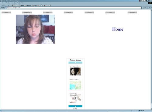
I just checked it out. The Thumbnails aren't loading for me - I just get a red x. The videos load and play, but it takes along time for the page to load. Also, because I have a very large monitor, the objects kind of explode all over the page.
My suggestions - use tables or css to locate your objects (buttons, videos etc.) specifically where you want them - that way they will be consistent on most browsers and monitors. If you need help, let me know, I can give you some pointers.
Figure out why the thumbnails aren't showing, and use them to link to the videos. That will reduce loading time on your page. - Also, Revver has a widget you can add to your page - I think it may be the same one LG15 uses on the right and lefthand side of the main page that lets you access all your videos through thumbnails - you might look into trying that.
Your buttons look great! and I love your videos! You are definitely on the right track here - keep up the good work
-
JamieGilmour
- Casual Observer
- Posts: 114
- Joined: Tue Feb 20, 2007 10:16 am
I cleared the page and added the widget code. Does it work now? Is anything missing?Luminous wrote: - Also, Revver has a widget you can add to your page - I think it may be the same one LG15 uses on the right and lefthand side of the main page that lets you access all your videos through thumbnails - you might look into trying that.
Your buttons look great! and I love your videos! You are definitely on the right track here - keep up the good work
http://www.jamiegilmour.net
The widget works great
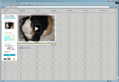
Your page is still scattered though. I'm posting a screen cap so you can see how it shows up on my monitor -
I am using IE version 6. My monitor is 1600 x 1200 pixels.
Like I mentioned before, if you use tables or css, you can lock your objects (buttons, picture, text, widget) in place so they don't blow apart like this.
Also, it would be nice to have a little description of you and your videos
Looking good!
-
JamieGilmour
- Casual Observer
- Posts: 114
- Joined: Tue Feb 20, 2007 10:16 am
Does this work?Luminous wrote:The widget works great
Your page is still scattered though. I'm posting a screen cap so you can see how it shows up on my monitor -
I am using IE version 6. My monitor is 1600 x 1200 pixels.
Like I mentioned before, if you use tables or css, you can lock your objects (buttons, picture, text, widget) in place so they don't blow apart like this.
Also, it would be nice to have a little description of you and your videos
Looking good!
http://jamiegilmour.net/links/
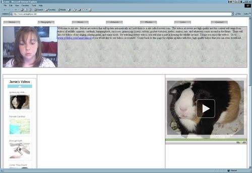
Here's what it looks like now:
Yes, I think it looks much better The background is a nice touch, and I like the addition of the thumbnails to the left and the large video - like how it's done on the LG15 site When you get around to it, it would be nice if you added a banner with a title and a picture of yourself at the top of the page. It would also be nice to have a short welcome/introductory paragraph about yourself and your videos.
It's coming along very nicely. Good work!
ETA: Also - is it possible to set the widget so that it displays more than 3 thumbnails? It would be nice to see more of them.
Yes, I think it looks much better
It's coming along very nicely. Good work!
ETA: Also - is it possible to set the widget so that it displays more than 3 thumbnails? It would be nice to see more of them.
-
JamieGilmour
- Casual Observer
- Posts: 114
- Joined: Tue Feb 20, 2007 10:16 am
That is what I am curious about. On lg home page the widget appears to be smaller. maybe I'll test out that option to make an advanced version of a widget.Luminous wrote:Here's what it looks like now:
ETA: Also - is it possible to set the widget so that it displays more than 3 thumbnails? It would be nice to see more of them.
-
JamieGilmour
- Casual Observer
- Posts: 114
- Joined: Tue Feb 20, 2007 10:16 am
How is this?Luminous wrote: ETA: Also - is it possible to set the widget so that it displays more than 3 thumbnails? It would be nice to see more of them.
http://www.jamiegilmour.net/
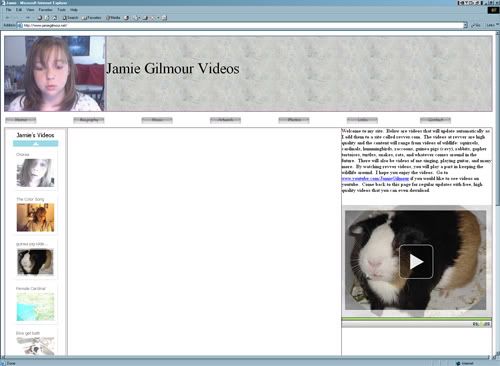
It's coming along nicely - your widget works great! I can see 10 out of your 11 video thumbnails! It looks like the table it is set in defaulted to an auto stretch table, so you should try setting it for an exact pixel width that fits the widget.
Your photo looks great!
You might try moving the text down into the same table that the slide show is in - above the video, and replace it in the banner with a title for your site like:
Animal Videos
by Jamie Gilmore
Or something like that - whatever you want to call your site.
Also, you might think about whether you want your buttons above or below your banner - that's a matter of choice. There is some space inbetween your banner and the body of your site - you could either close that space up, or place your buttons there.
Looking good Jamie
-
JamieGilmour
- Casual Observer
- Posts: 114
- Joined: Tue Feb 20, 2007 10:16 am
Lots of great suggestions. I'll work on that when my newest video finishes processing. I needed a break from the webpage thing. I'm sure you probably needed a break from all the advise and screen capturing too. heheLuminous wrote:It's coming along nicely - your widget works great! I can see 10 out of your 11 video thumbnails! It looks like the table it is set in defaulted to an auto stretch table, so you should try setting it for an exact pixel width that fits the widget.
Your photo looks great!
You might try moving the text down into the same table that the slide show is in - above the video, and replace it in the banner with a title for your site like:
Animal Videos
by Jamie Gilmore
Or something like that - whatever you want to call your site.
Also, you might think about whether you want your buttons above or below your banner - that's a matter of choice. There is some space inbetween your banner and the body of your site - you could either close that space up, or place your buttons there.
Looking good Jamie
-
JamieGilmour
- Casual Observer
- Posts: 114
- Joined: Tue Feb 20, 2007 10:16 am
How about nowLuminous wrote:It's coming along nicely - your widget works great! I can see 10 out of your 11 video thumbnails! It looks like the table it is set in defaulted to an auto stretch table, so you should try setting it for an exac ......
http://www.jamiegilmour.net/
That's looking really good Jamie - I think the Banner is much better. The buttons look good underneath it, and the text block is a nice introduction.
The only thing that still needs a little work is that for some reason the video/text block is bouncing over to the right of the page, leaving a big empty white column in the middle. Maybe you have three columns in your table instead of two? Anyway, if you can figure out how to get the text block (which is very nice, btw) and the video back over to the left, next to your thumbnail widget like it was originally, that would be great. Looks like it's almost done.
The only thing that still needs a little work is that for some reason the video/text block is bouncing over to the right of the page, leaving a big empty white column in the middle. Maybe you have three columns in your table instead of two? Anyway, if you can figure out how to get the text block (which is very nice, btw) and the video back over to the left, next to your thumbnail widget like it was originally, that would be great. Looks like it's almost done
-
JamieGilmour
- Casual Observer
- Posts: 114
- Joined: Tue Feb 20, 2007 10:16 am