Page 1 of 3
First contribution, Period.
Posted: Wed Nov 29, 2006 11:10 pm
by Period
Excellent!
Posted: Thu Nov 30, 2006 12:04 am
by SharpI
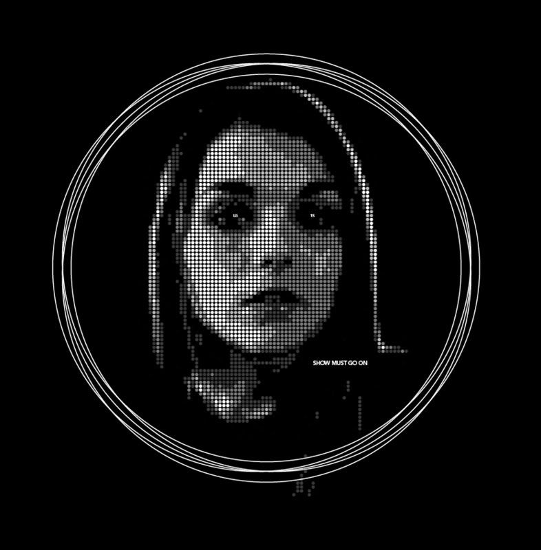
That. Is. Totally. Excellent. Period. The "LG" and "15" as eyegleams really make it! Love the concept and the execution.
Posted: Thu Nov 30, 2006 3:02 am
by Sami
I liked this one.
'Show must go on' is my favorite slogan next to 'does this looks like the kids you would eat lunch with?'
Nice job
Posted: Thu Nov 30, 2006 3:16 am
by lonelyfan13
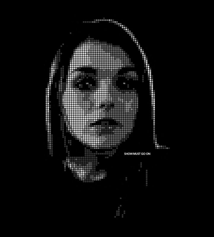
take away the circles around it, and you have a winner!
Posted: Thu Nov 30, 2006 3:19 am
by Sami
lonelyfan13 wrote:take away the circles around it, and you have a winner!
Yeah! I agree!
Posted: Thu Nov 30, 2006 7:53 pm
by anngry
Sami wrote:lonelyfan13 wrote:take away the circles around it, and you have a winner!
Yeah! I agree!
agreed as well.
but very nice design.
Posted: Thu Nov 30, 2006 9:31 pm
by Languorous Lass
Creepy.
Posted: Thu Nov 30, 2006 9:46 pm
by Period
It was previously requested : so should this be (w/o the crop circles).
http://i142.photobucket.com/albums/r97/ ... 1164940991
Here it is so.
So so & so.
P.
Posted: Fri Dec 01, 2006 6:20 am
by Sami
Posted: Fri Dec 01, 2006 7:52 pm
by cup o' noodles
This is a really awesome design! You must have a great knack for these thing!
Really, really great job! *huggles*
Posted: Sat Dec 02, 2006 5:24 am
by Period
Posted: Sat Dec 02, 2006 10:15 am
by cup o' noodles
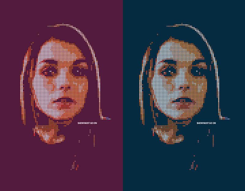
Hmm. The new ones are nice, but I'm still kida leaning towards the black and white. I think all of them are really awesome, though! *huggles*
Posted: Sun Dec 03, 2006 1:07 pm
by Leaven
The best submissions I have seen! I actually kinda like the circles too.
Posted: Sun Dec 03, 2006 4:32 pm
by livelongandprosper77
I do think that the black and white without circles is my favorite. As the Darklord of the Sith would say: "Impressive, most impressive."

Posted: Mon Dec 04, 2006 8:50 pm
by Period
Nothing new but the recap link of all this post graphics :
http://s142.photobucket.com/albums/r97/Period_folder/
P.