I took your advice! but just ONE last question
Posted: Fri Nov 17, 2006 2:22 am
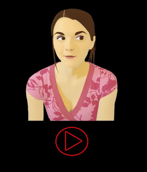
okay so I listened to all of your feedback and redesigned my TShirt.
Like you guys said, I redrew her in a more "Bree-like" pose...
I know someone wanted me to draw her with her hat...but I'd already started my drawing when I saw that...and now I'm way too tired to ever draw bree again. sorry! (maybe i'll do it a week from now..that hat is damn cute)
someone also suggested that I put the Play-Button on TOP...I tried it, it looked really weird...so I moved it back. sorry!
The new version is Anti-Aliased too (if anyone knows what that means).
if you don't, trust me....it's essential when you're planning to turn an image into a T-shirt
(and I REALLY REALLY hope they like my design and DO turn it into a tshirt)
so here's the new version:
(click on it to make it full size)
my ONLY question is...
should I keep the lonelygirl15.com logo when I submit?
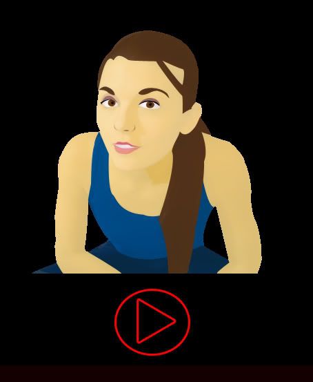
otherwise it'll look a bit more dramatic, like this...
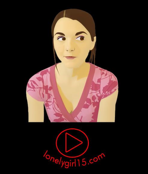
oh and just in case anyone prefers the OLD one...let me know NOW..i'm submitting in like a day or so:
Like you guys said, I redrew her in a more "Bree-like" pose...
I know someone wanted me to draw her with her hat...but I'd already started my drawing when I saw that...and now I'm way too tired to ever draw bree again. sorry! (maybe i'll do it a week from now..that hat is damn cute)
someone also suggested that I put the Play-Button on TOP...I tried it, it looked really weird...so I moved it back. sorry!
The new version is Anti-Aliased too (if anyone knows what that means).
if you don't, trust me....it's essential when you're planning to turn an image into a T-shirt
(and I REALLY REALLY hope they like my design and DO turn it into a tshirt)
so here's the new version:
(click on it to make it full size)
my ONLY question is...
should I keep the lonelygirl15.com logo when I submit?
otherwise it'll look a bit more dramatic, like this...
oh and just in case anyone prefers the OLD one...let me know NOW..i'm submitting in like a day or so:

